Add a Custom Item Interface
To create a custom item interface for any module, follow the steps below:
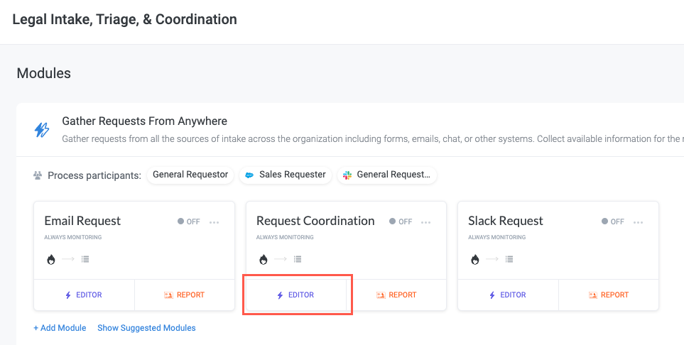
Navigate to the module you want to create the custom interface for and select Editor. The module builder displays.
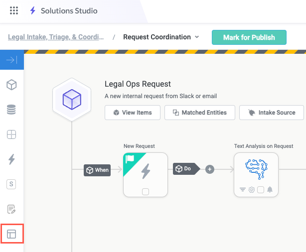
Select the Interfaces button in the module builder toolbar. The Interfaces panel displays.
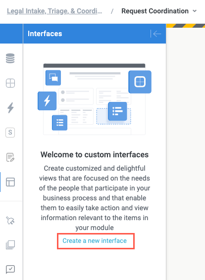
Select Create a new interface. The Create New Interface window displays.
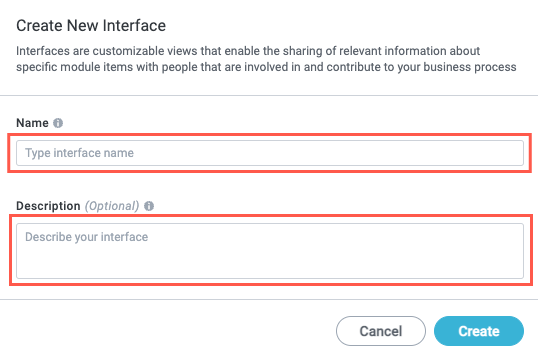
Enter a Name and Description, if desired, for the new interface, then select Create. The interface builder displays.
You've created a new custom interface for your module. Next, add widgets and fields to complete your interface.
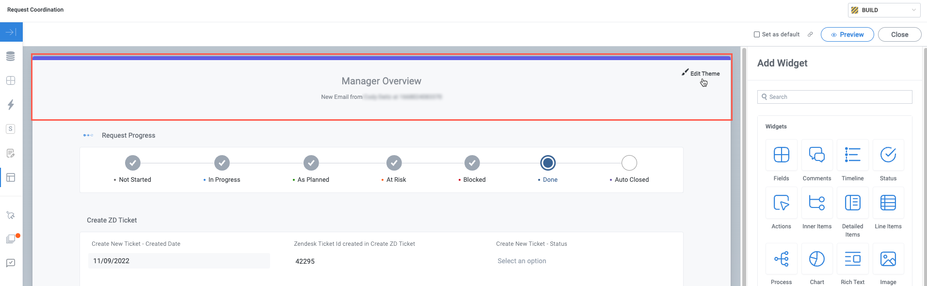
Add and Configure Widgets
Widgets are pre-built, self-contained units that serve a specific function in your interface. This includes providing read-only information to users, like the status of their request, a table of data source records, or embedded content. Widgets can also act as inputs to create a form experience; these input-type widgets can collect information, enable users to upload files, or provide a rich search experience.
See Custom Interface Widgets for a list of all available widgets and their functions.
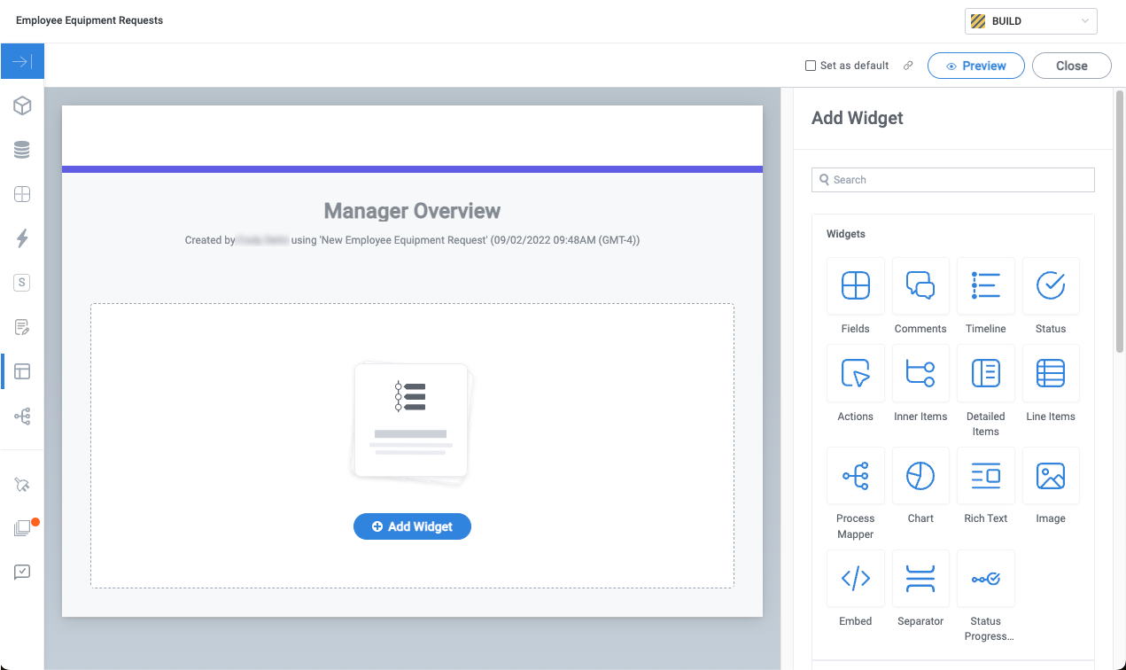
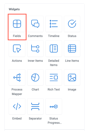
In the right panel of the interface builder, locate the Widgets section.
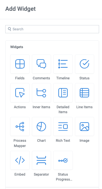
Select the widget you want to add to the interface. The widget is added to the interface and displays in the interface builder, along with the configuration panel.
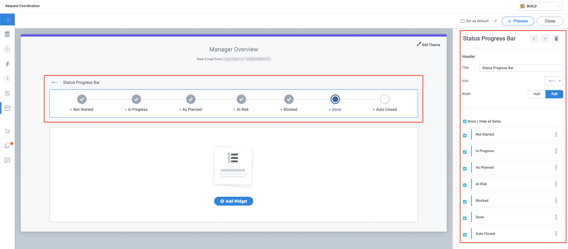
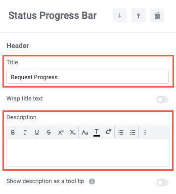
In the Header section of the configuration panel, update the Title and add a Description, if desired.
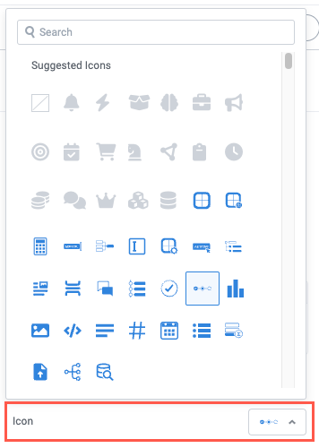
Select an Icon or remove the default icon.
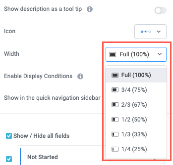
Set the display Width. Widgets automatically adjust to display side-by-side with other widgets that fit in the same row. For example, if three consecutive widgets are set to 1/3 width, they'll all display in the same row.
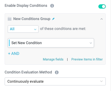
If you want to conditionally show or hide the widget, you turn on the Enable Display Conditions toggle. A new conditions group displays. Configure the conditions group.
For more configuration details, see Display Widgets Dynamically.
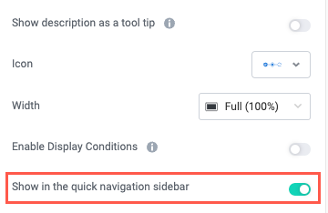
To add a direct link to the widget in the quick navigation, turn on the Show in the quick navigation sidebar toggle.
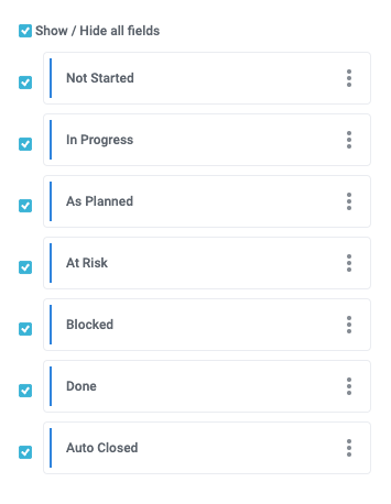
Below the Header section is a widget-specific section that contains the relevant content for the specific widget you're configuring. For example, in the Status Progress Bar widget, this section displays a list of available status field that you can select to include in the widget.
The Header section is shared by all widgets, but not all widgets have an additional widget-specific section. The Rich Text widget, for example, only has a Header section because it has no relevant configuration.
To add another widget, select Add Widget below the existing widgets.
Add Fields
Fields comprise the core content of most interfaces—they provide the information that users want to track and take action on. For this reason, one of the most common widgets is the Fields widget, which enables you to display any fields that are available in the module. Additionally, some widgets, like Status and Inner Items, contain select fields you can display or complement with additional fields.
In addition to the selected fields contained within widgets like Status, there are several ways to add fields to your interface. For details about the different methods for adding fields, see the sections below:
Add Fields with the Fields Widget
The Fields widget provides a clean starting point from which you can add any fields that are available in the module. This widget contains no pre-selected fields and enables you to choose only the fields you want to include:
Add a new widget and select the Fields widget. The widget is added to the interface and displays in the interface builder, along with the configuration panel.
In the Fields section of the configuration panel, select the available dropdown and choose the field you want to include.
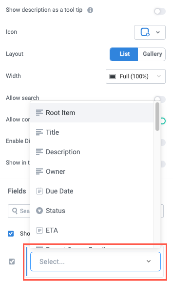
You can select the checkbox beside each field to hide or show the field.
Fields by Type
To simplify the interface building process, there are preconfigured Fields widgets for each field type, as well as for any matched entity fields in your module. To add a field type-specific Fields widget, follow the steps below:
In the right panel of the interface builder, locate the Fields By Type section.
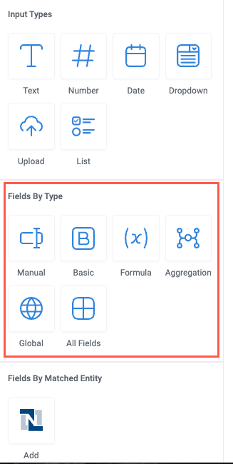
Select the field type you want to add to the interface. The field type is added to the interface and displays in the interface builder, along with the configuration panel.
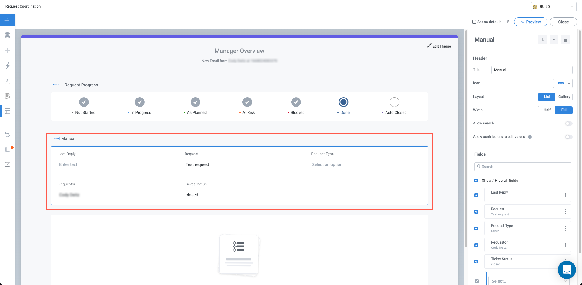
Configure the Header and Fields sections as desired.
Fields by Matched Entity
In much the same way you can add fields by type using the preconfigured Fields widgets, you can add fields created by the matched entities in your module.
In the right panel of the interface builder, locate the Fields By Matched Entity section.
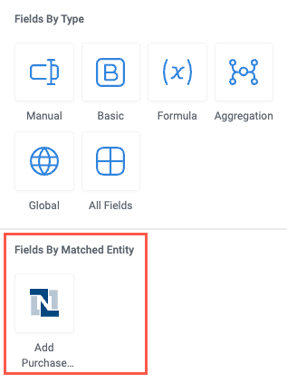
Select the matched entity whose fields you want to add to the interface. The fields for the selected matched entity are added to the interface and display in the interface builder, along with the configuration panel.
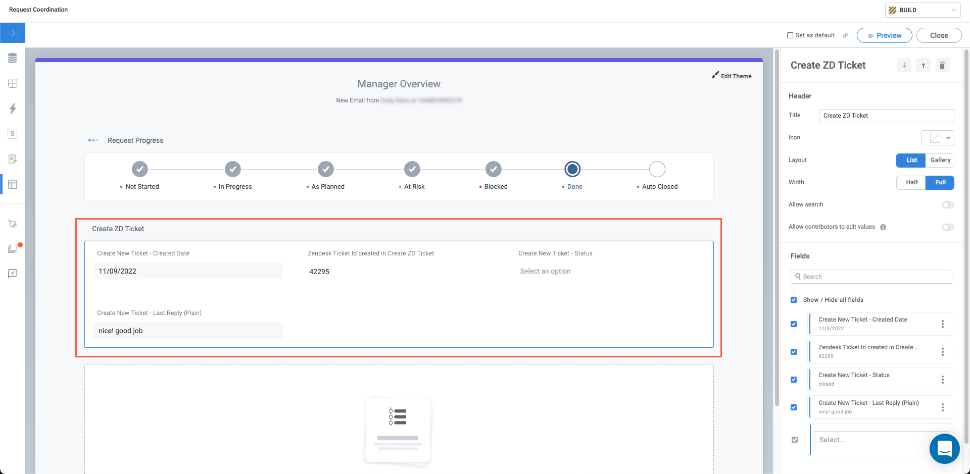
Configure the Header and Fields sections as desired.
Add Fields in Another Widget
Some widgets contain fields as part of their configuration. For example, the Status widget contains the Status, Due Date, and Owner basic fields, among others. To include additional fields, follow the same process outlined in steps #1-2 in Add Fields with the Field Widget.
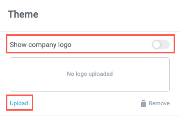
Edit the Interface Theme
Once your interface has all the necessary content, you can customize its theme, including displaying your company logo, editing the interface title and subtitle, and choosing colors.
If your board admin has set a theme for the board in board settings and disabled the override, you cannot edit the interface theme.
Select anywhere in the interface header. The Theme configuration panel displays.
Upload a company logo, if desired, and turn on the Show company logo toggle to display it on your interface.
Enter a Title and Subtitle for the interface. Select the insert field icon,
 , to include fields from your module in the title or subtitle.
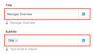
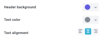
Specify a color for the header background and text by selecting a color from the color picker. Additionally, choose whether the text is left-aligned, center-aligned, or right-aligned (center-aligned is the default).
Publish and View the Interface
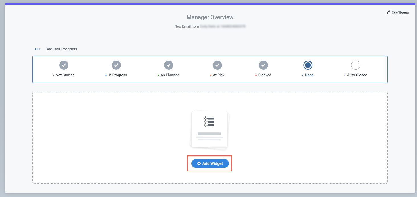
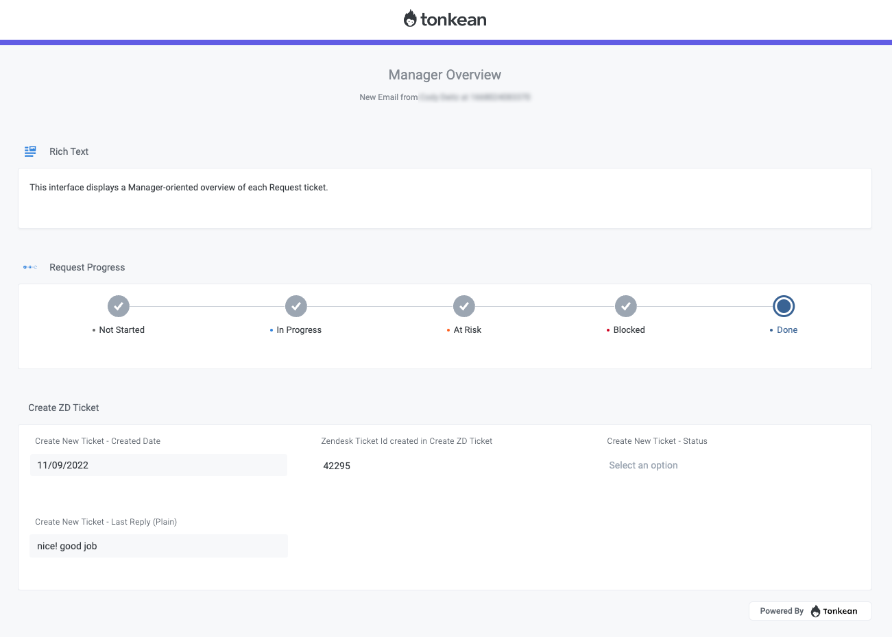
After creating a custom interface, you must publish the solution that contains the relevant module. Then, navigate to the business report for the module to view the interface. Below is an example of a custom interface viewed in from the business report:
Set the custom interface as the default in the top right of the interface builder.
Once the relevant solution is published, anyone with access to the business report can view and use the custom interface.