Build Form Flows with Custom Interfaces
In addition to displaying important information for a business request, you can also use custom item interfaces to build a dynamic form experience, allowing you to gather important information to initiate or continue a workflow. Custom item interfaces are the recommended way to build intake experiences for your internal requesters because of their responsiveness, simplicity, and dynamic behavior.
For process contributors to view and fill out interface forms, your admin must set module permissions to allow all users on your Tonkean board to View and edit the relevant module. See Configure Module Settings for more information.
Build a Form with a Custom Interface
To build a form using custom item interfaces, follow the steps below:
Create a Custom Interface
Add and configure any fields needed to store the values you want to gather as part of your process. For example, if you want a requester to specify the date for a contract renewal, you must create a date field, Contract Renewal Date.
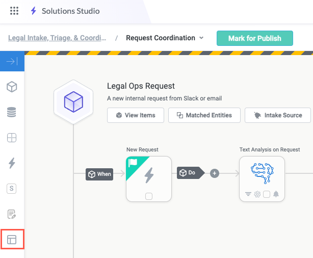
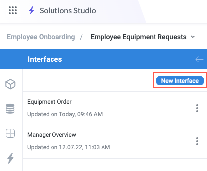
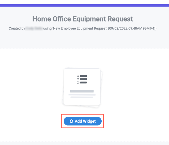
Navigate to the relevant module and select the Interfaces button in the module builder. The Interfaces panel displays.
Select New Interface. The Create New Interface window displays.
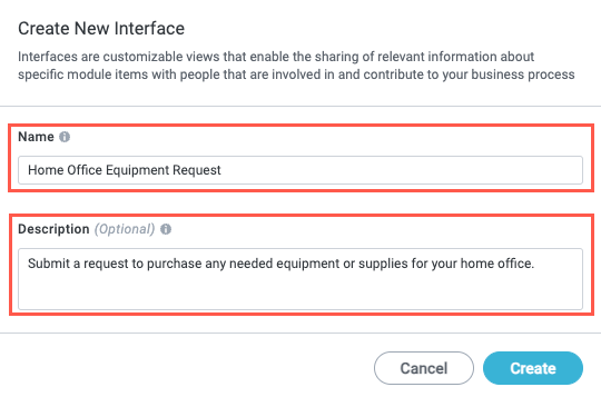
Enter a Name and Description for the interface. For this example, we are creating an intake form for an employee requesting home office equipment. When finished, select Create. The interface builder displays.
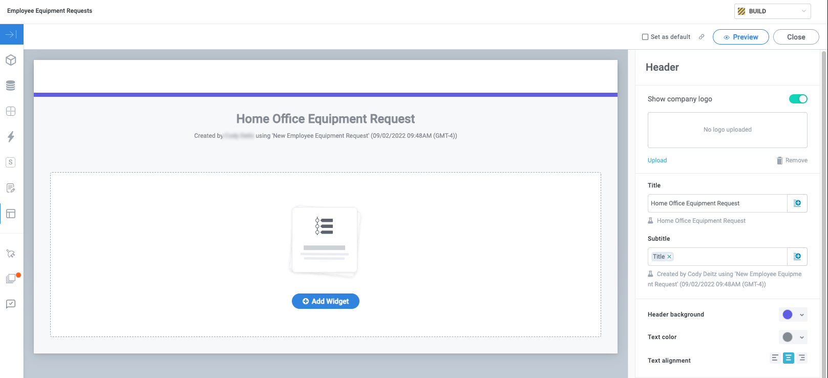
Your interface is ready for you to start building.
Build the Interface Form
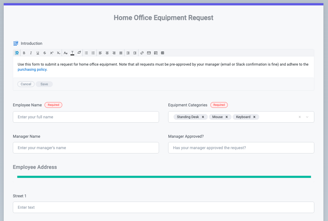
With the interface created, you can add widgets to build out a form experience. In our example, our intake form asks requesters to provide some basic information about home office equipment they want to purchase.
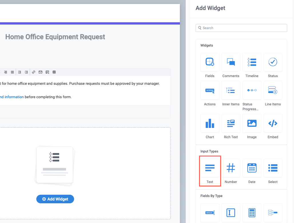
Select + Add Widget to add a new widget to the interface. The Add Widget panel displays on the right side of the screen.
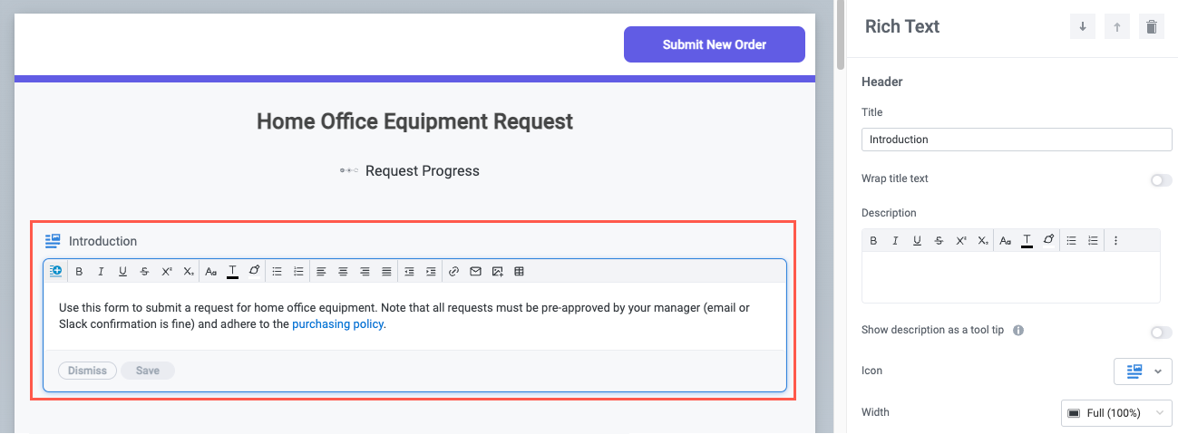
Select and configure the first widget. In our example, the requester is filling out a simple purchase request, so we use a Rich Text widget to provide a brief description of the process and provide a link to the relevant purchasing policy:
Next, add the Input widgets to collect the needed information from the requester. Select + Add Widget, then select an Input Type widget. In our example, we first add a Text widget. The Text widget configuration panel displays.
Note that the Rich Text widget is read-only, whereas the Text widget is an Input Type widget.
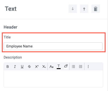
Retitle the Text widget with the appropriate field label (for example, "Employee Name" in our purchase request form interface).
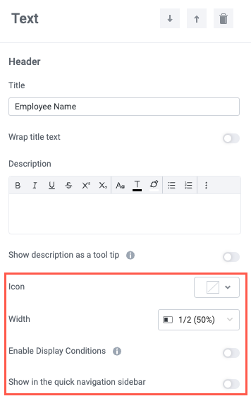
Select how to display the widget:
Icon - Select an icon to display beside the widget field label.
Width - Set the widget display width. Widgets automatically adjust to display side-by-side with other widgets that fit in the same row. For example, if three consecutive widgets are set to 1/3 width, they'll all display in the same row.
Enable Display Conditions - When enabled, this option allows you to specify a condition that, when satisfied, displays the widget. Otherwise, the widget is hidden.
Show in the quick navigation sidebar - When enabled, a link to the widget displays in the quick navigation below the interface title.
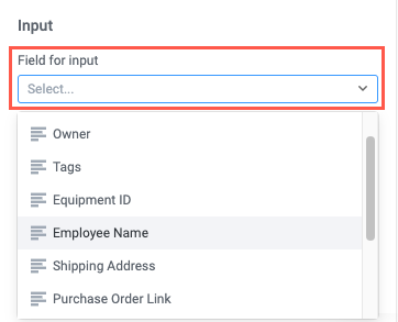
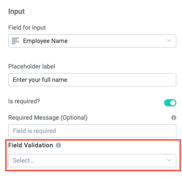
In the Input section, select the Field for input. This is the field where the user-input value is stored. For our example "Employee Name" Text input, we select the Employee Name field we created in our module.
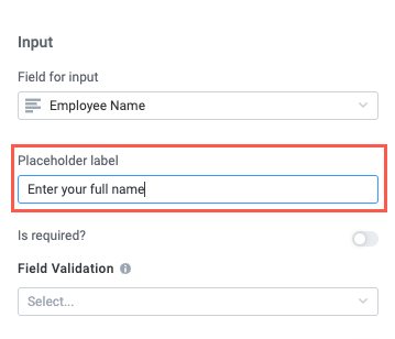
Enter a Placeholder label, if desired.
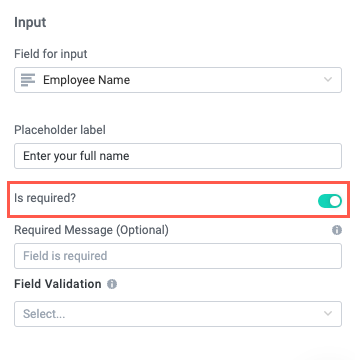
If it's a required field, turn on the Is required? toggle.
When turned on, the optional Required Message displays, where you can include a message that displays in place of the placeholder text when the required value is missing.
If relevant, select a Field Validation method using either a preset or custom regular expression:
Valid Email - The value must be a valid email address.
Valid URL - The value must be a valid URL.
Valid Phone Number - The value must be a valid phone number.
Custom Validation - Define a custom validation rule using a regular expression. For more information about writing regular expressions, see RegExr.
Repeat the steps above to add all the input widgets you want to include in your form. After adding more widgets, our sample purchase request form has all the basics:
Interface Form Building Tips and Best Practices
While adding and configuring widgets in a custom interface is generally intuitive, there are several best practices and tips that can help you create the best experience for your requesters—including making your experience responsive to the requester's selections and organizing the form for legibility.
Displays Widgets Dynamically
With the Enable Display Conditions option, you can configure widgets to display dynamically based on a user's input. This ability ensures you only ask a user questions that are relevant to them, and avoid overwhelming them with too much information.
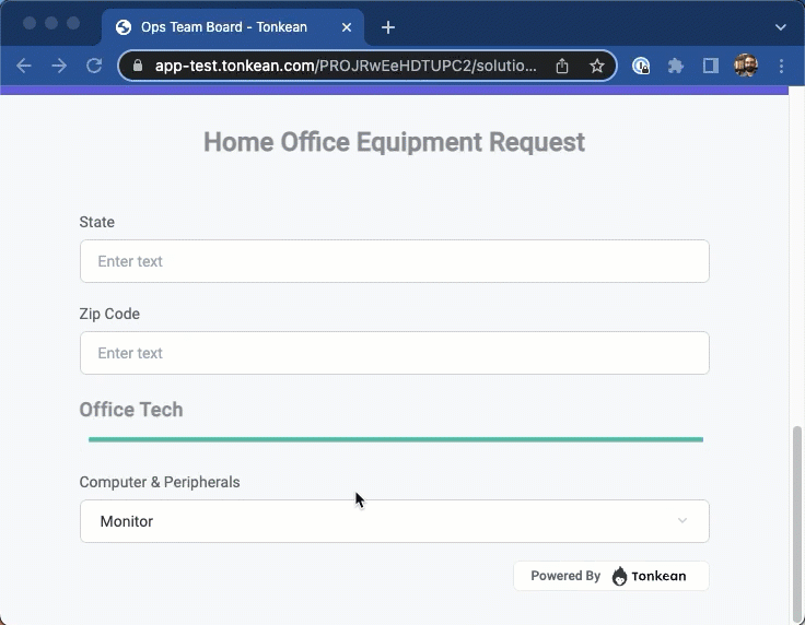
For example, we might have a field in our office equipment purchase request, Computer & Peripherals where new employees can request a laptop. We can specify a condition where, if they select Laptop in this field, we display a follow-up field, Computer Type that asks them whether they prefer a Macbook or Windows machine:
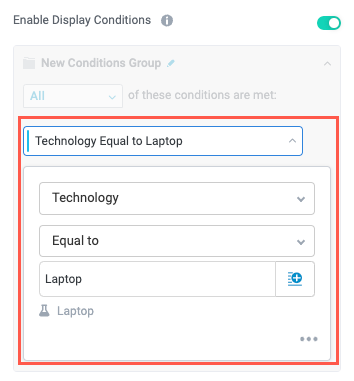
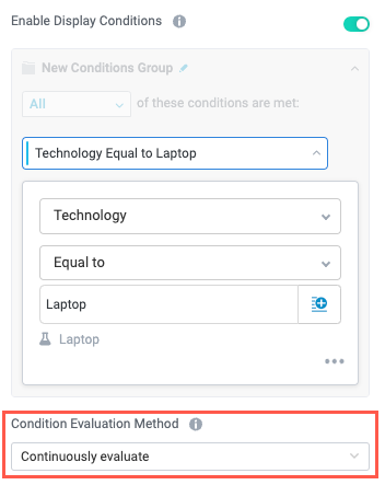
For the field you want to display conditionally, select the corresponding input widget, then turn on the Enable Display Conditions toggle. A new conditions group displays.
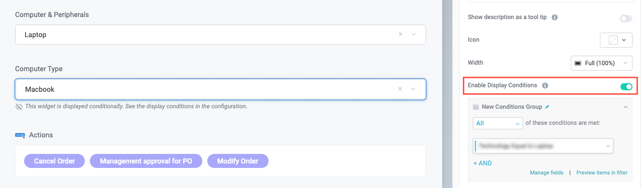
In the conditions group, select Set New Condition, then configure the field to display only when the previous field has the appropriate value. In our example, we set the Computer Type field to display only when the Technology field is set to Laptop.
Set Condition Evaluation Method to Continuously evaluate, ensuring that each input in the interface prompts a refresh to display conditional widgets.
The end result is an interface with dynamic fields that respond to the user's input. Note that you can configure widgets with multiple conditions to create complex display logic.
Add Sections with the Separator Widget
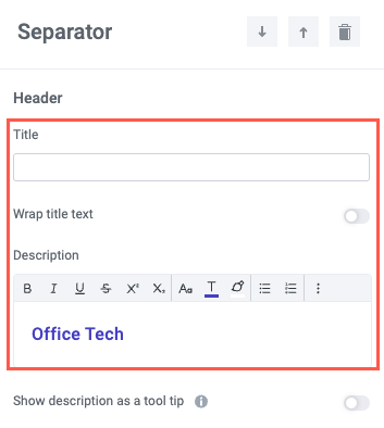
In addition to dynamically showing and hiding fields or groups of fields based on user input, another way to improve the experience for requesters is to visually organize your form into groups of related fields. You can do this by adding a Separator widget:
Add a new Separator widget.
To remove the Title for a plain separator, edit the Title to be a space, effectively removing the widget title. To add a customizable Title for the separator, use the Description rich text editor to add in a section title with formatted text.
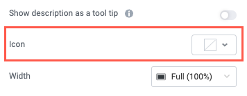
Select the Icon dropdown or select no icon.
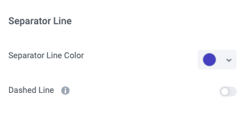
In the Separator Line section, select a Separator Line Color and whether to make the separator a Dashed Line.
You now have a section divider you can use to visually organize your form. Select the up and down arrows in the top of the widget configuration panel to move the divider on the interface.
Theme your Interface Form
Customize the look and feel of your form to align with your organization's brand:
If your admin has set a board-level default theme, you are unable to edit interface themes.
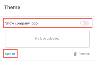
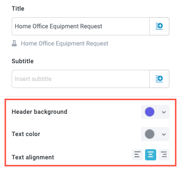
Select anywhere in the interface header. The Theme configuration panel displays.
Select Upload to add your company logo and turn on the Show company logo toggle to display it on your interface. We'll upload the Tonkean logo.
Next, select colors for the header background by selecting from the color picker. You can also choose the header text alignment. We'll change our header background to Tonkean purple and leave the text center-justified.
Your interface is themed to match your company brand.
Leverage the Custom Interface Form in the Module Workflow
Once you have one or more custom interface forms, you can add them to your module workflow. How and where you leverage an interface depends on your specific business process, but most use cases employ interface forms either as intake forms or to add information to an existing request as it moves through a workflow.
Send an Interface Form as an Intake Form
To leverage an interface form as part of a request intake experience, follow the steps below:
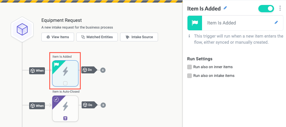
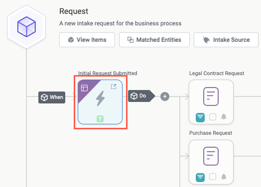
In the relevant module, update the default Item is Added trigger to an Interface Submitted trigger:
Select the Item Is Added trigger. The Item Is Added panel displays.
Select the edit icon,
 , and select Interface Submitted. The trigger type is updated to Interface Submitted.
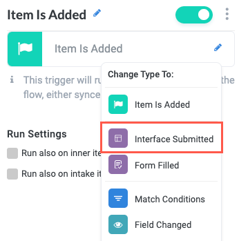
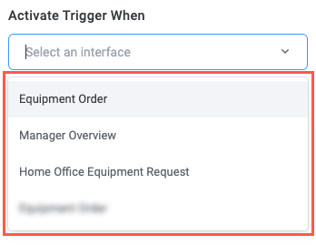
In the Interface Submitted panel, select the Activate Trigger When dropdown and select an interface from the list provided.
Interfaces must already exist in your module to appear in this dropdown. For information about creating interfaces, see Create Custom Item Interfaces.
Select the add block button,
 , after the configured Interface Submitted trigger. The Sequence Actions menu displays.
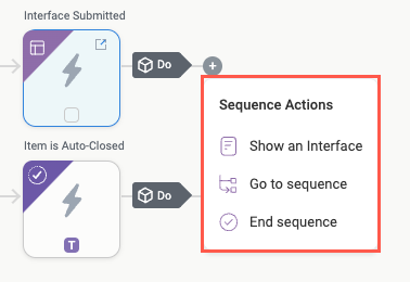
Select the appropriate option for your process:
Show an Interface - Display a custom item interface to a user. Use this action to display an interface to a user as part of an intake flow, including a final step interface that provides request tracking information
Go To Sequence - Reuse a sequence already in your module, directing the user to that sequence.
End Sequence - Complete a sequence in your module workflow, enabling you to provide a thank you message and redirect the user to a URL
Regardless with option you select, you can add action blocks after the interface actions to continue the workflow.
Set Up the Intake Sequence Tracker
The intake sequence tracker is a visual tracker that shows each step in your intake process and which step the requester is currently on. Enabling the intake sequence tracker helps provide context for requesters, showing them where they are in the larger process and what steps they can expect next.
The intake sequence tracker works by displaying to requesters the intake statuses applied to each intake sequence step in your workflow (for example, Show an Interface, End Sequence). To configure the intake sequence tracker, enable the tracker display and add intake statuses to the relevant intake sequence actions:
In the relevant module, add intake statuses that correspond to the steps in your intake sequence. Note that you need a separate status for each unique step you want to display in the intake sequence tracker.
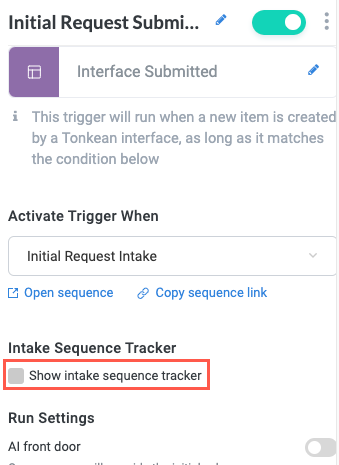
Next, select the Interface Submitted trigger that begins an intake sequence. The Interface Submitted configuration panel displays.
In the Intake Sequence Tracker section, select the Show intake sequence tracker checkbox. The intake sequence tracker options display.
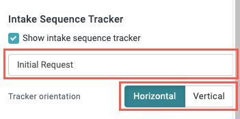
Enter a title for the sequence tracker, then select whether the tracker displays in a Horizontal or Vertical orientation. The configuration of the intake sequence tracker is complete.
Finally, update the item statuses in each of the target intake sequence steps:
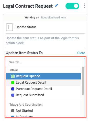
Select the Change Status button on the trigger or action block. The Update Status panel displays.
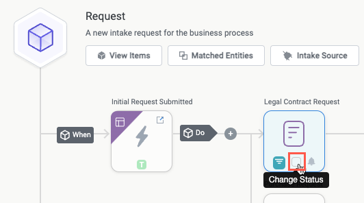
In the Update Item Status To section, select the dropdown and choose the intake status to update to. In our example, we're updating the intake status for the Legal Contract Request step, so we select Legal Request Detail.
Repeat this step for each trigger and action in your intake sequence.
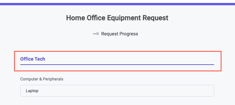
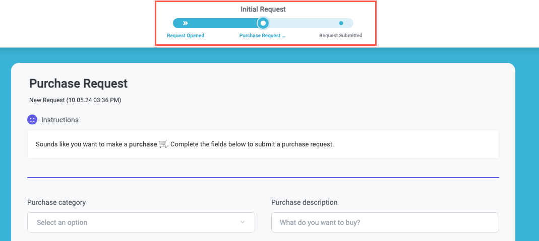
In our finished example, we see the requester view. It shows that the requester is midway through the intake process:
Send an Interface Form Mid-Flow
In addition to using an interface form as an intake form, you can send an interface form at virtually any point during your workflow to gather important information. Sending an interface form is the same process as sending any other custom item interface, using the Send Item Interface action:
In the relevant place in your module workflow, select the add action button,
, then select the Send Item Interface action. The Send Item Interface configuration panel displays.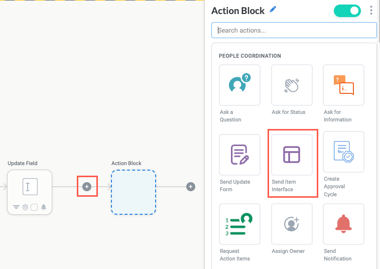
Configure the Send Item Interface action as desired, sending the relevant interface.
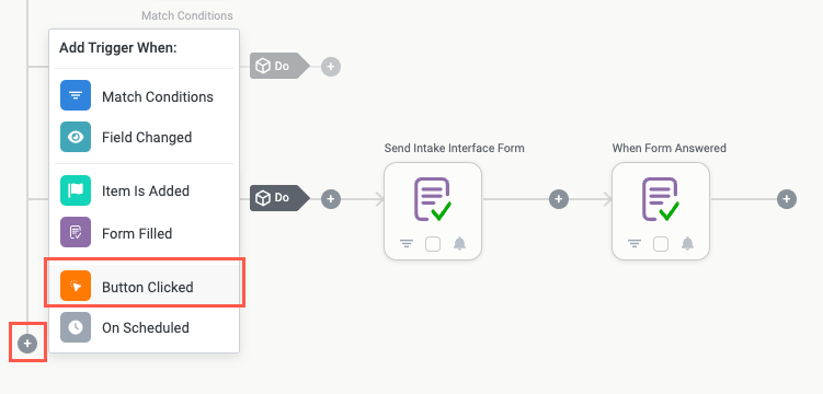
Send an Interface Form using the Button Clicked Trigger
In addition to manually sending a link to an interface form, you can allow users to open the interface for themselves by selecting a button. This is a helpful option if you have an interface from which users may want to open the form.
To send an interface form using the Button Clicked trigger, you must first add the logic in the relevant module, then add the action in the interface or workspace app.
Add the Send Interface Logic
Before creating the button users can select to send an interface, you must create the logic in your module:
In the relevant module, add a new Execute Action trigger.
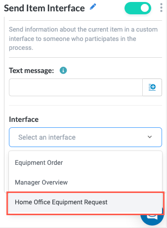
Add a new action block and select the Send Item Interface action. The Send Item Interface configuration panel displays.
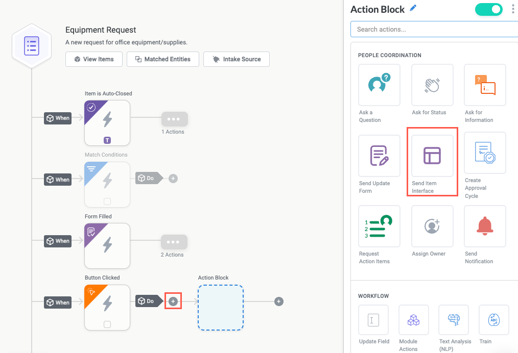
Configure the Send Item Interface as needed. Select the Interface you want to send.
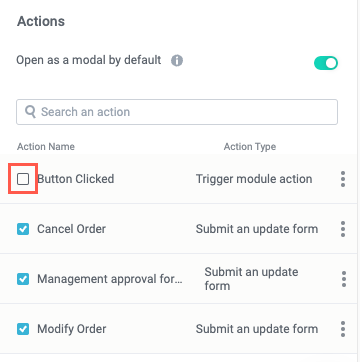
Configure the Button in the Interface
Once the module logic is configured, you can add the button that, when selected, activates the module logic to send the interface:
Navigate to the relevant interface and add an Actions widget.
In the Actions widget configuration panel, scroll down to the Actions section and select the Button Clicked checkbox. The Button Clicked action displays in the interface.
Select the kebab,
 , for the Button Clicked action, then select Edit action label.
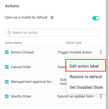
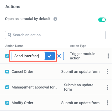
Enter a descriptive name for the button label (for example, "Send Interface"), then select the checkmark to save.
Your action button is ready. Be sure the logic that's activated by the relevant Button Clicked trigger is turned on and that the module is published.