Timeline Widget
Provide a timeline of changes and updates for a given request. The Timeline widget shows updates that include when buttons are selected, when statuses change, when comments are added, and so on. The Timeline widget is helpful for maintaining a simple change log for a request.
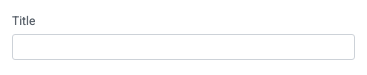
Title
Set the title of the widget. Include a descriptive title to help users understand the specific content of the widget.
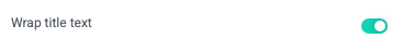
Wrap title text
Select whether to wrap title text that extends beyond the available display width. When not selected, long titles are truncated with an ellipsis.
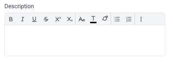
Description
Add a description for the widget. This description displays below the widget title.
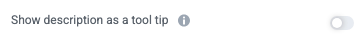
Show description as a tool tip
Select whether to display the widget description as a tool tip, hiding it by default.
When displayed as a tool tip, any rich text formatting in the description is removed.
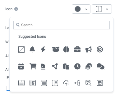
Icon
Change the widget icon and icon color—or remove the icon. Widgets always include a default icon.
Select the crossed-out icon option,  , to remove the icon.
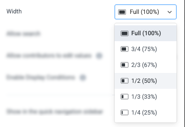
Width
Set the display width of the widget.
The width settings of neighboring widgets determine the resulting display on the interface. For example, two neighboring widgets set to 50% width display side by side. Similarly, if one widget is set to 1/3 and the following widget is set to 2/3, the widgets will display side by side.
We recommend experimenting with widget width settings and widget placement to optimize the interface display for the screen size you're designing for. That is, if you're designing an interface for a large screen (say, a request tracking interface), you can use small widget widths and include multiple widgets together. However, if designing for mobile, leaving widgets at 100% widths is generally best.
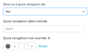
Show in the quick navigation sidebar
Select whether to display the widget in the quick navigation bar. When this option is enabled, you can set the quick navigation menu label override and edit the label icon.