Module Items Widget
Display items from a module. Use this widget to provide a view of requests with options to filter those requests for specific personas or use cases.
For information about how Tonkean sorts data in widget tables and other areas of the platform, see Understanding Sorting in Tonkean.
Title
Set the title of the widget. Include a descriptive title to help users understand the specific content of the widget.
Description
Add a description for the widget. This description displays below the widget title.
Show description as a tool tip
Select whether to display the widget description as a tool tip, hiding it by default.
When displayed as a tool tip, any rich text formatting in the description is removed.

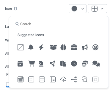
Icon
Change the widget icon and icon color—or remove the icon. Widgets always include a default icon.
Select the crossed-out icon option,  , to remove the icon.
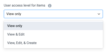
User access level for items
Configure the user access settings for items: whether users can view, edit, or create items.
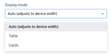
Display mode
Configure how the widget displays on the interface:
Auto - The widget displays items in a table or as cards, depending on the device width. Narrow displays default to Card display while wider displays default to Table display.
Table - The widget displays items in a table.
Cards - The widget displays items as cards.
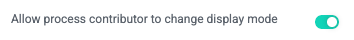
Allow process contributor to change display mode
Select whether to allow process contributor users to manually change the display mode in the interface. When selected, a toggle appears on the interface users can select to change the display between Table or Card mode.
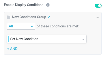
Enable Display Conditions
Select whether to dynamically display the widget based on custom conditions. When enabled, a conditions group displays; when the specified conditions are met, the widget displays.
For example, you can set a condition to display an input-type widget only if a user enters a specific value, prompting the user to provide additional information.
For more information about configuration condition groups, see Conditions.
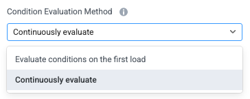
Condition Evaluation Method
Set how display conditions are evaluated:
Evaluate conditions on the first load - Evaluate conditions only when the page first loads. This option does not dynamically show or hide relevant widgets when a user makes a selection; refreshing the page is required.
Continuously evaluate (default) - Continuously evaluate conditions as the user views and interacts with the interface. Use this option to enable the interface to dynamically show or hide relevant widgets based on user input.
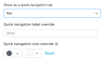
Show as a quick navigation tab
Select whether to display the widget as a quick navigation tab. When this option is set to Yes, this widget and all those below it will display on a single tab until the next widget that's configured to display as the quick navigation tab. Additionally, you can set the quick navigation menu label override and edit the label icon.
Items
Configure the options for creating, displaying, and exporting items.
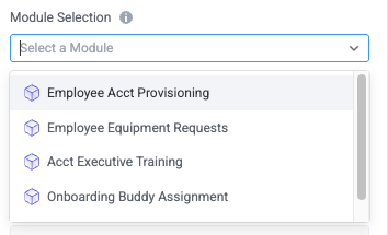
Module Selection
Select which module to display items from. The default value is the current module.
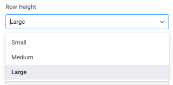
Row Height
Set the display height for each item row.
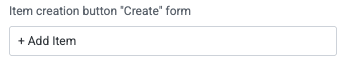
Item creation button "Create" form
Set the button title for the create form to create a new item. (A create form must exist for this to display.)
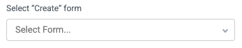
Select "Create" form
Enable users to create an item using a create form.
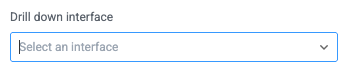
Drill down interface
Select the interface that displays in the main area of the interface when users select an item in the Inner Items widget.
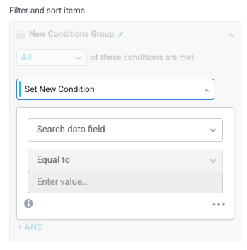
Filter and sort items
Apply conditions that determine which items display in the widget.
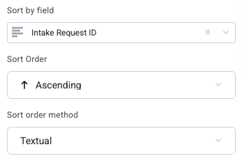
Sort by field
Select a field to sort the items by as a default.
When you select a field to sort by, additional options display for the Sort Order and Sort order method.
Match inner items
Select whether to display inner items that match the display conditions. Enable this option to display relevant inner items (that is, child items of the currently displayed inner items).

Enable expanding items
Select whether to display nested inner items when viewed as a table.
Enable pivot mode
Select whether to allow users to use pivot mode in the widget dropdown menu.
Enable charts
Select whether to enable users to create dynamic charts using item table data.
Enable advanced filters
Select whether to display the advanced filter mode, which allows users to enter complex filter conditions across columns in a single input.
The advanced filter can display fields that are included but deselected in the Table Fields section.

Enable saved views
Select whether to enable saved views from the item table at the top of the widget. If enabled, saved views display as buttons at the top of the widget, enabling users to more easily switch between views.
Enable column filters
Select whether to display the column filter option.
Display record count in header
Select whether to display the count of records in the widget header.
Emphasize Text
Select whether to make the primary text bold for improved readability in some use cases.
Show deactivated items
Selected whether to display deactivated items in the item table.
Enable export of items
Select whether to allow users to export filtered items in CSV or XLSX format.
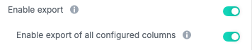
Enable export of all configured columns
Select whether to allow users to export only the visible (filtered) columns or all columns configured for the widget.
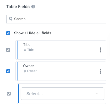
Table Fields
Select the module fields to display in the widget when items (or inner items) display as a table.
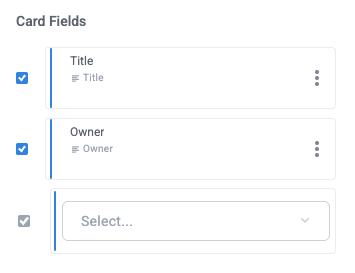
Card Fields
Select the module fields to display in the widget when inner items display as cards.
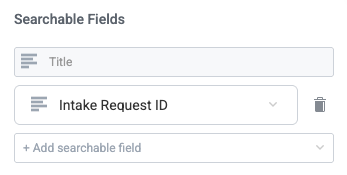
Searchable Fields
Select the module fields that are searchable in the widget. Select + Add searchable field to include an additional field.
The default Title field is always searchable.
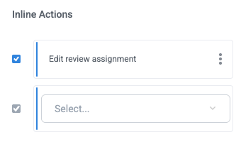
Inline Actions
Add actions users can initiate in-line on the inner item by selecting the options button,  .
.
Use Table Filter, Pivots, and Charts
Widgets based on item tables provide various options for exploring and analyzing your item data. In addition to displaying items, the widget supports advanced capabilities—such as filtering, pivoting, saved views, and charts—that help you analyze the same dataset from multiple perspectives. This ability enables you to turn item data into clear, interactive insights without leaving the interface.
With these visualization and analysis capabilities, you can:
Explore data visually to quickly spot trends, outliers, and patterns
Slice and aggregate data using the same filters and pivots you use in the grid
Build multiple chart configurations from a single dataset without duplicating data
See changes reflected in real time as item values update
Availability of filters, pivot mode, charts, and saved views depends on how the widget is configured in the interface builder.
Filter Table Content
Filters let you control which items appear in the table and in any charts derived from it. Use filters to focus on a specific subset of data, such as items in a particular status, owned by a specific user, or within a numeric range.
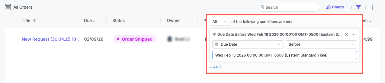
Apply Advanced Table Filters
Table filters apply to all items in the table.
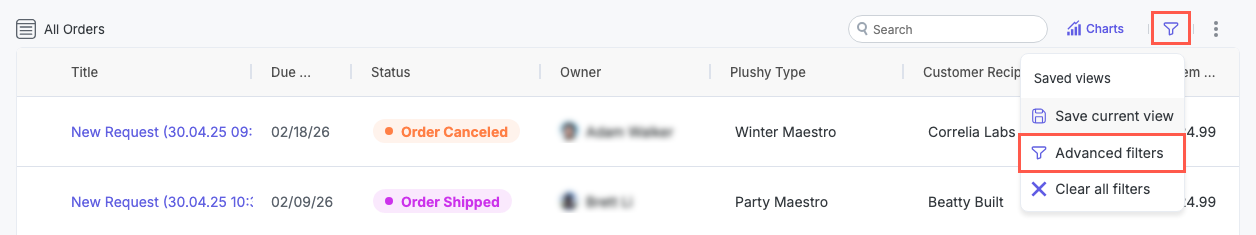
Select the filter icon,
 , in the upper right corner of the widget. The filter options display.
Select Advanced filters. The filter conditions group displays.
Configure filter conditions to apply custom filters to all table items.
To clear filters, select the filter icon,
, then select Clear all filters.
When you apply a filter:
The table updates immediately to show only matching items.
Any charts based on the table recalculate using the filtered data.
Column filters are applied in conjunction with advanced filters; the table displays only items that match both filter sets.
The filter icon displays as filled, indicating a filter is applied.
Apply Column Filters
Column filters apply only to the data in the selected column. The available filters are drawn from the data in that column. That is, a column defined as a closed dropdown displays only those dropdown options, while text fields allow a free text search.
In addition to filtering for values in each column, you can sort column values by selecting a column header and the arrow button that displays.
Display column filters must be turned on in the interface builder.
Hover over the column header value (the field label). The filter icon,
, displays.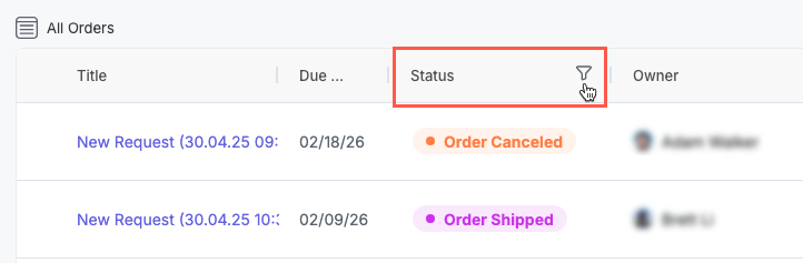
Select the filter icon,
. Available values to filter by display. Select one or more values to filter the data.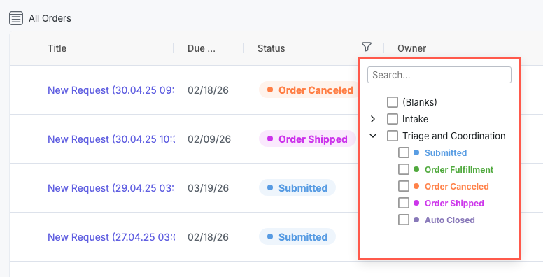
Add and Configure Table Charts
Table charts enable you to turn item data into flexible, real-time visualizations without duplicating or exporting data. Because charts are built directly on top of the items table, they reflect the same filters, pivots, and live updates as the table itself.
Charts are designed to support both quick insights and deeper analysis. You can use them for various purposes:
Summarizing large datasets at a glance
Comparing values across statuses, owners, or other dimensions
Validating trends by immediately drilling into the underlying items
You can add one or multiple charts to the same widget, customize how data is grouped and aggregated, and save different chart configurations as views. This makes it easy to switch between summary dashboards and detailed analysis using the same underlying dataset.
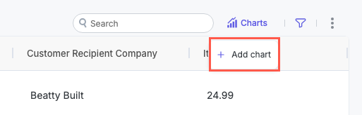
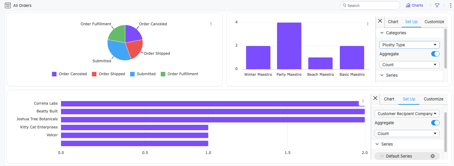
Add Charts
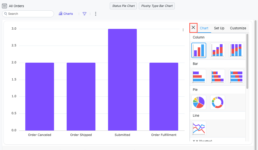
In the upper right corner of the widget, select Charts > Add chart. The chart configuration menu displays.
On the Chart tab, select the chart type.
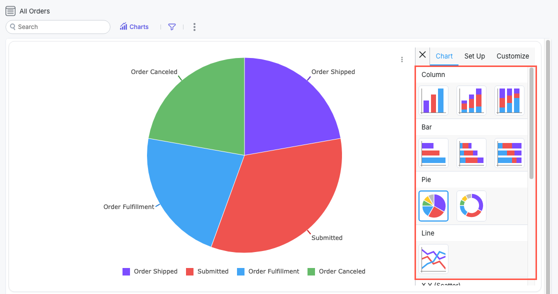
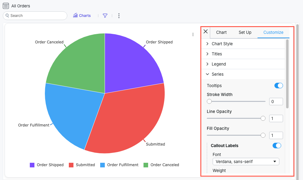
Select the Set Up tab to configure the chart data and how it displays.
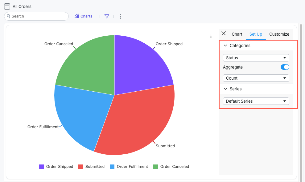
Select the Customize tab for granular configuration options for Chart Style, Titles, Legend, and Series.
Select Charts > Add chart to add and configure additional charts in the same view.
Remember, you can save a table view to return to it later.
To close the chart configuration menu, select the x at the top of the menu.
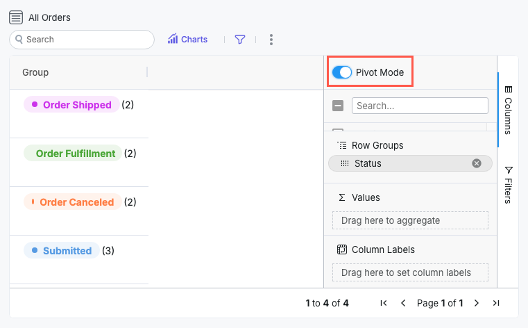
Use the Pivot Function
Pivot mode enables you to group and aggregate items to analyze totals, counts, and other metrics across different dimensions.
Enable and Configure Pivot Mode
Select the three dots icon,
 , then select Show pivot. The Pivot Mode menu displays.
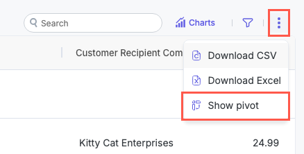
Drag available fields into Row Groups to group items by the selected field value. Select the group labels in the table to open and view all items in that group.
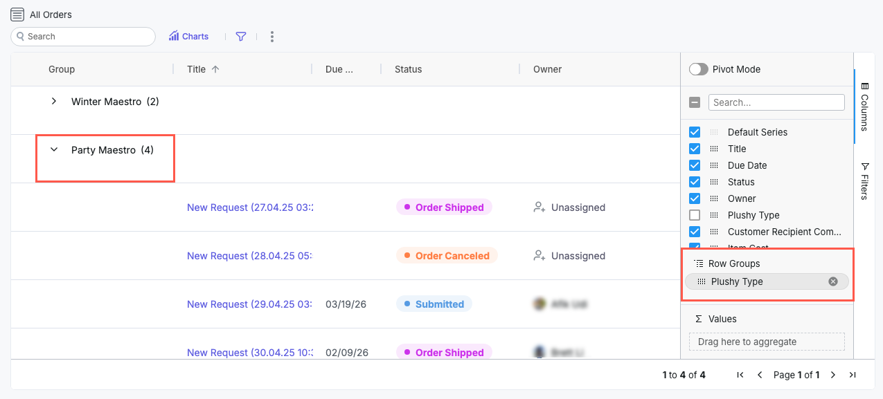
Drag available fields into Values to generate sum columns for those fields. Sum values display only for relevant fields, such as item counts.
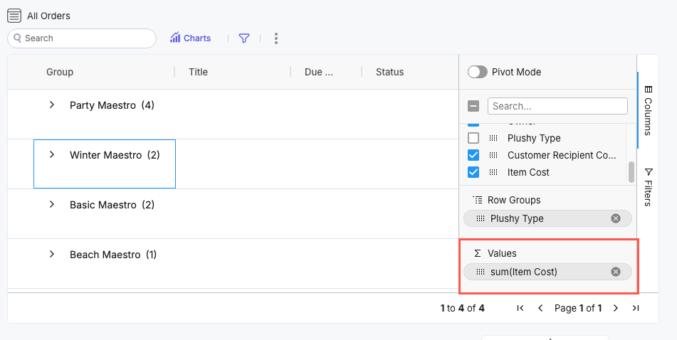
Select the Pivot Mode toggle to enable or disable pivot mode, which removes all columns except for those added in Row Groups or Values.
To hide the pivot configuration options, select the three dots icon, , then select Hide pivot.
We recommend you save the table view for your pivot configuration so you can easily return to it later.
Save Table Views
You can save a view to capture a specific filter or configuration of the widget so you can return to it later. You can also use views to easily switch between multiple ways of analyzing the same data. For example, you can create a high-level summary view and a detailed operational view—without duplicating data or creating additional widgets.
A saved view can include the following:
Active filters
Pivot configuration
Chart setup (if enabled)
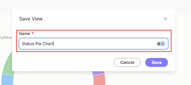
To save a view, follow the steps below:
Configure your table view as desired, including charts, table filters, pivots, and so on.
Select the filter button,
, and select Save current view. The Save View window displays.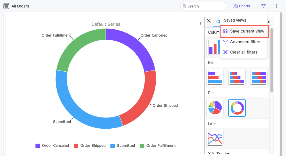
Enter a Name for the view, then select Save. Your view is saved.
Saved views display in the filter menu:
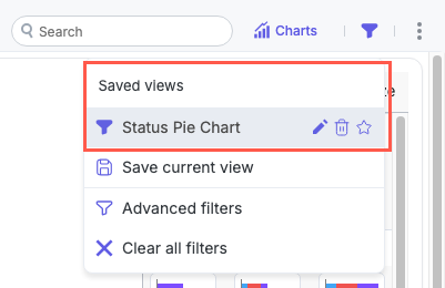
Once saved, you can toggle between views by selecting them in the filter menu to instantly change how the same set of items is displayed and summarized.
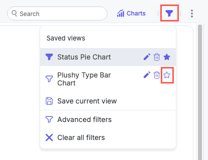
Add a View as a Favorite
You can add a saved view as a favorite view, adding a button for the view at the top of the widget.
To add a view as a favorite, open the filter menu and select the star for the relevant view:
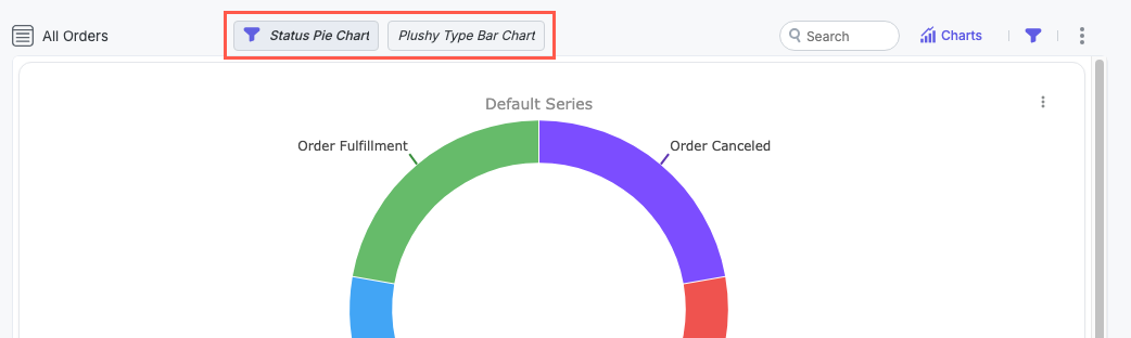
Favorited views display at the top of the widget, where you can easily switch between them. Selecting the active view removes it, essentially clearing all filters:
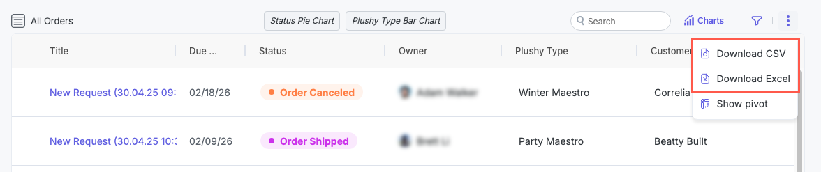
Download Widget Data
Item table widgets enable users to download the contents of the table. This option helps export this data into another application for additional analysis or to download an ad-hoc snapshot of item data.
To download widget data, follow the steps below:
Select the three dots icon,
, in the upper right.Select Download CSV or Download Excel.
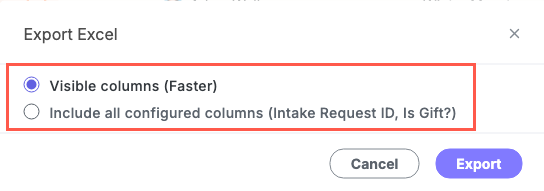
If Allow export of all configured columns is enabled, the option to download only Visible columns or to Include all configured columns displays. Select your preferred option and then select Export.
If Allow export of all configured columns is not enabled, the download starts immediately.
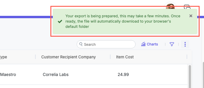
A download message displays in the upper right:
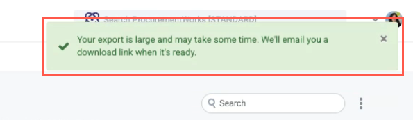
Handling Large Downloads
To accommodate the download of large item counts, Tonkean provides an asynchronous download function. Tonkean switches to this large download behavior when the number of items multiplied by the number of fields in each item is greater than 5,000.
The process for initiating the download is the same as for smaller item counts. However, when you start the download, a different message displays in the upper right, informing you that the export is large and you'll receive a download link in your email.
You will receive an additional update message in the upper right when the download is done processing. At that time, you'll receive an email where you can download the exported file. This email provides an overview of how your data is split between multiple CSV or XLSX files (where the data volume exceeds Tonkean's export limit):
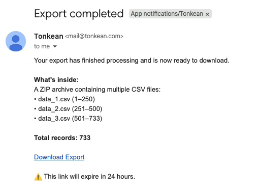
Select Download Export to download your exported files in a compressed zip file.