Rich Text Widget
Add a read-only rich text widget to display text, images, web links, and more, on an item interface. You can use this widget to display any rich text, including markdown, or include fields from your module workflow (such as formula fields, matched entity fields, and so on).
Images must be added with a URL. Images cannot be copied and pasted into the Rich Text widget.
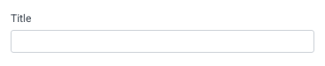
Title
Set the title of the widget. Include a descriptive title to help users understand the specific content of the widget.
Wrap title text
Select whether to wrap title text that extends beyond the available display width. When not selected, long titles are truncated with an ellipsis.

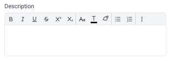
Description
Add a description for the widget. This description displays below the widget title.
Show description as a tool tip
Select whether to display the widget description as a tool tip, hiding it by default.
When displayed as a tool tip, any rich text formatting in the description is removed.

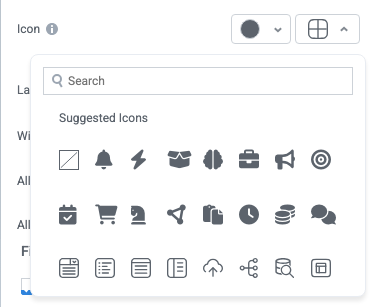
Icon
Change the widget icon and icon color—or remove the icon. Widgets always include a default icon.
Select the crossed-out icon option,  , to remove the icon.
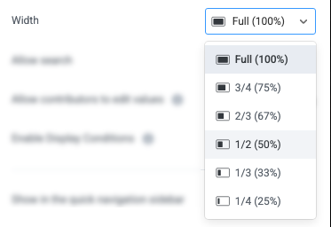
Width
Set the display width of the widget.
The width settings of neighboring widgets determine the resulting display on the interface. For example, two neighboring widgets set to 50% width display side by side. Similarly, if one widget is set to 1/3 and the following widget is set to 2/3, the widgets will display side by side.
We recommend experimenting with widget width settings and widget placement to optimize the interface display for the screen size you're designing for. That is, if you're designing an interface for a large screen (say, a request tracking interface), you can use small widget widths and include multiple widgets together. However, if designing for mobile, leaving widgets at 100% widths is generally best.
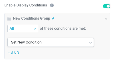
Enable Display Conditions
Select whether to dynamically display the widget based on custom conditions. When enabled, a conditions group displays; when the specified conditions are met, the widget displays.
For example, you can set a condition to display an input-type widget only if a user enters a specific value, prompting the user to provide additional information.
For more information about configuration condition groups, see Conditions.
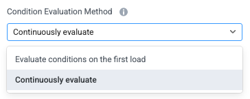
Condition Evaluation Method
Set how display conditions are evaluated:
Evaluate conditions on the first load - Evaluate conditions only when the page first loads. This option does not dynamically show or hide relevant widgets when a user makes a selection; refreshing the page is required.
Continuously evaluate (default) - Continuously evaluate conditions as the user views and interacts with the interface. Use this option to enable the interface to dynamically show or hide relevant widgets based on user input.
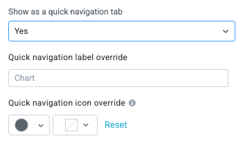
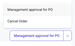
Show as a quick navigation tab
Select whether to display the widget as a quick navigation tab. When this option is set to Yes, this widget and all those below it will display on a single tab until the next widget that's configured to display as the quick navigation tab. Additionally, you can set the quick navigation menu label override and edit the label icon.
Hide widget background
Select whether to hide the widget background, displaying the buttons as stand-alone elements on the main interface background.

Actions
Configure actions above the Rich Text widget.
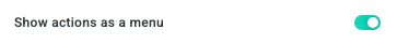
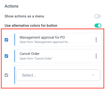
Show actions as a menu
Select whether to display available actions as buttons (default) or in a menu in the upper right corner of the widget.
User alternative colors for button
Select whether to show the default color scheme for the button (determined at the interface level in theme settings) or the alternative colors—generally a light/dark inversion intended to display better on dark backgrounds.
Select actions to include
Select the module actions to include above the Rich Text widget.
To edit an action label, remove an action, or configure button states to determine when buttons display, select the three dots icon,  . Additionally, you can hover over the action tile and select the up and down arrows to rearrange the actions on the widget
Preview the Rich Text Widget
For the Rich Text widget, we recommend you always select Preview in the upper right of the interface builder. While markdown and other formatting are automatically converted to display as they will to end users, it's still important to confirm the content displays properly.
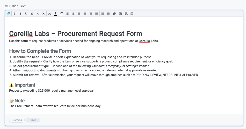
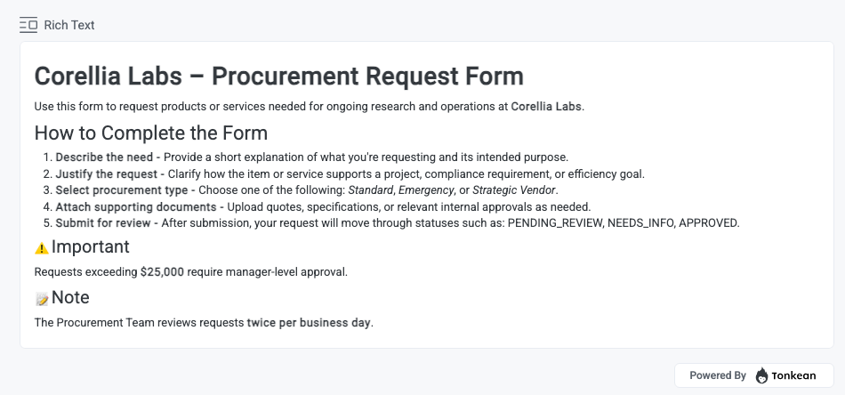
Below is an example of some text created with markdown and the rich text toolbar, and the resulting widget in Preview mode.
Note that you must select Save in the Rich Text widget in the interface builder for your changes to display in Preview mode.
In the interface builder:
In the interface preview:
Add Content with the Rich Text Widget
Use the Rich Text widget to display formatted text and dynamic data to end users.
Add and Edit Content
In edit mode, you can add content to the Rich Text widget in the following ways:
Type or paste formatted text, including markdown or HTML-formatted content.
Use the rich text toolbar to apply formatting such as headings, bold text, lists, and links.
Insert fields, including manual fields, matched entity fields, and formula fields. Field values are checked on page load and display dynamic values in the interface.
Save or Cancel Changes
After editing the widget content:
Select Save to apply your changes.
Select Cancel to discard your changes.
The interface updates only after you save. Unsaved changes do not appear in Preview mode or to end users.