Embed Widget
Embed a wide range of content using a view-only iframe. Use this widget to add virtually any content that can be embedded, including Google Slides, YouTube videos, Google Maps, PDFs, and even other websites.
While most media can be embedded using a direct link, some applications require a certain process to generate an embedded link (for example, embedding content from the Google Suite requires publishing that file to the internet). Refer to the relevant documentation for your application or media type.
Title
Set the title of the widget. Include a descriptive title to help users understand the specific content of the widget.
Wrap title text
Select whether to wrap title text that extends beyond the available display width. When not selected, long titles are truncated with an ellipsis.

Description
Add a description for the widget. This description displays below the widget title.
Show description as a tool tip
Select whether to display the widget description as a tool tip, hiding it by default.
When displayed as a tool tip, any rich text formatting in the description is removed.

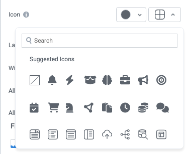
Icon
Change the widget icon and icon color—or remove the icon. Widgets always include a default icon.
Select the crossed-out icon option,  , to remove the icon.
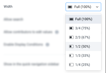
Width
Set the display width of the widget.
The width settings of neighboring widgets determine the resulting display on the interface. For example, two neighboring widgets set to 50% width display side by side. Similarly, if one widget is set to 1/3 and the following widget is set to 2/3, the widgets will display side by side.
We recommend experimenting with widget width settings and widget placement to optimize the interface display for the screen size you're designing for. That is, if you're designing an interface for a large screen (say, a request tracking interface), you can use small widget widths and include multiple widgets together. However, if designing for mobile, leaving widgets at 100% widths is generally best.
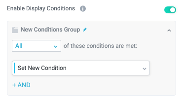
Enable Display Conditions
Select whether to dynamically display the widget based on custom conditions. When enabled, a conditions group displays; when the specified conditions are met, the widget displays.
For example, you can set a condition to display an input-type widget only if a user enters a specific value, prompting the user to provide additional information.
For more information about configuration condition groups, see Conditions.
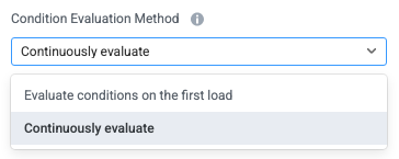
Condition Evaluation Method
Set how display conditions are evaluated:
Evaluate conditions on the first load - Evaluate conditions only when the page first loads. This option does not dynamically show or hide relevant widgets when a user makes a selection; refreshing the page is required.
Continuously evaluate (default) - Continuously evaluate conditions as the user views and interacts with the interface. Use this option to enable the interface to dynamically show or hide relevant widgets based on user input.
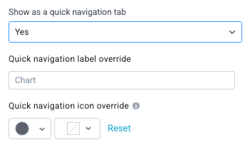
Show as a quick navigation tab
Select whether to display the widget as a quick navigation tab. When this option is set to Yes, this widget and all those below it will display on a single tab until the next widget that's configured to display as the quick navigation tab. Additionally, you can set the quick navigation menu label override and edit the label icon.
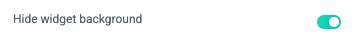
Hide widget background
Select whether to hide the widget background to allow the embedded content to use all available space.
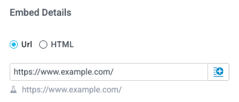
Embed Details
Configure the content source and display height of the embed.
Content Source: URL or HTML
Select whether to insert a URL or HTML in the widget:
Url - Insert an embeddable URL for the content you want to include. We recommend testing the specific URL, as some websites and third-party applications do not allow their content to be embedded using a URL.
HTML - Insert the HTML to embed content. We recommend testing the HTML to ensure it displays as desired.
The HTML option has built-in protection against harmful code, preventing things like HTML injection attacks.
Select the insert field button,  , to dynamically include content from elsewhere in your workflow.
Height
Enter a value for the embed widget display height in pixels. Or, if you selected the HTML option, you can use CSS values, such as auto.