Line Items Widget
Add detailed line items that roll up to a parent request. Use this widget to display or capture detailed information about an invoice, purchase request, or similar item.
For information about how Tonkean sorts data in widget tables and other areas of the platform, see Understanding Sorting in Tonkean.
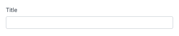
Title
Set the title of the widget. Include a descriptive title to help users understand the specific content of the widget.
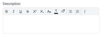
Description
Add a description for the widget. This description displays below the widget title.
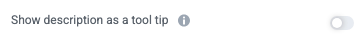
Show description as a tool tip
Select whether to display the widget description as a tool tip, hiding it by default.
When displayed as a tool tip, any rich text formatting in the description is removed.
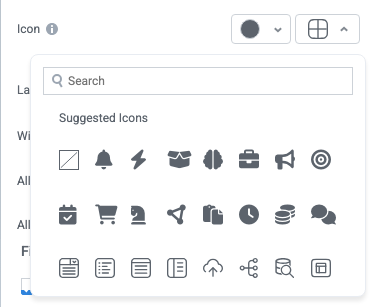
Icon
Change the widget icon and icon color—or remove the icon. Widgets always include a default icon.
Select the crossed-out icon option,  , to remove the icon.
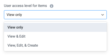
User access level for items
Configure the user access settings for items: whether users can view, edit, or create items.
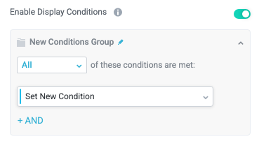
Enable Display Conditions
Select whether to dynamically display the widget based on custom conditions. When enabled, a conditions group displays; when the specified conditions are met, the widget displays.
For example, you can set a condition to display an input-type widget only if a user enters a specific value, prompting the user to provide additional information.
For more information about configuration condition groups, see Conditions.
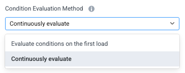
Condition Evaluation Method
Set how display conditions are evaluated:
Evaluate conditions on the first load - Evaluate conditions only when the page first loads. This option does not dynamically show or hide relevant widgets when a user makes a selection; refreshing the page is required.
Continuously evaluate (default) - Continuously evaluate conditions as the user views and interacts with the interface. Use this option to enable the interface to dynamically show or hide relevant widgets based on user input.
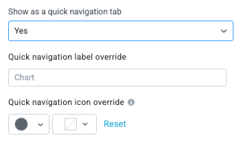
Show as a quick navigation tab
Select whether to display the widget as a quick navigation tab. When this option is set to Yes, this widget and all those below it will display on a single tab until the next widget that's configured to display as the quick navigation tab. Additionally, you can set the quick navigation menu label override and edit the label icon.
Items
Configure the options for creating, displaying, and exporting items.
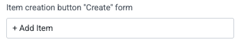
Item creation button "Create" form
Set the button title for the create form to create a new item. (A create form must exist for this to display.)
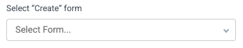
Select "Create" form
Enable users to create an item using a create form.
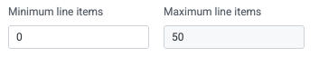
Minimum line items and Maximum line items
Set the minimum and maximum number of line items to display in the widget.
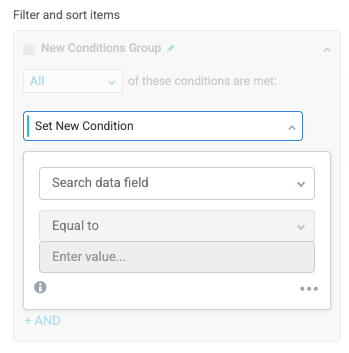
Filter and sort items
Apply conditions that determine which items display in the widget.
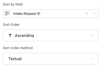
Sort by field
Select a field to sort the items by as a default.
When you select a field to sort by, additional options display for the Sort Order and Sort order method.
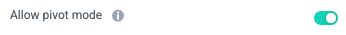
Enable pivot mode
Select whether to allow users to use pivot mode in the widget dropdown menu.
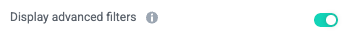
Enable advanced filters
Select whether to display the advanced filter mode, which allows users to enter complex filter conditions across columns in a single input.
The advanced filter can display fields that are included but deselected in the Table Fields section.
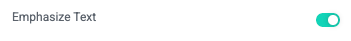
Emphasize Text
Select whether to make the primary text bold for improved readability in some use cases.
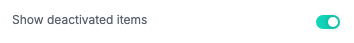
Show deactivated items
Selected whether to display deactivated items in the item table.
Enable export of items
Select whether to allow users to export filtered items in CSV or XLSX format.
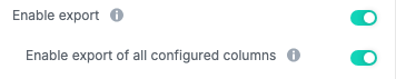
Enable export of all configured columns
Select whether to allow users to export only the visible (filtered) columns or all columns configured for the widget.
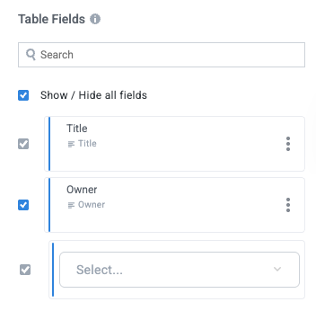
Table Fields
Select the module fields to display in the widget.
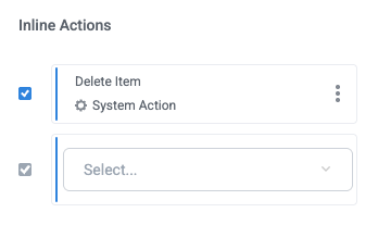
Inline Actions
Add actions users can initiate in-line on the item by selecting the options button,  .
.
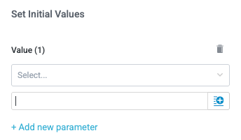
Set Initial Values
Select whether to set any initial values for specified fields as a new item is created in the widget. To set initial values, select + Add new parameter, select the field you want to set a value for, and insert the value (select the insert field button,  , to set a dynamic value).