Image Widget
Add an image and image alt text to a widget. Use this widget to include static images that provide context or visually display item information.
The maximum file size is 5MB, and the supported file types are JPG, JPEG, and PNG.
Title
Set the title of the widget. Include a descriptive title to help users understand the specific content of the widget.
Wrap title text
Select whether to wrap title text that extends beyond the available display width. When not selected, long titles are truncated with an ellipsis.

Description
Add a description for the widget. This description displays below the widget title.
Show description as a tool tip
Select whether to display the widget description as a tool tip, hiding it by default.
When displayed as a tool tip, any rich text formatting in the description is removed.
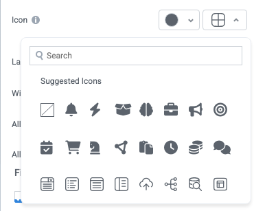
Icon
Change the widget icon and icon color—or remove the icon. Widgets always include a default icon.
Select the crossed-out icon option,  , to remove the icon.
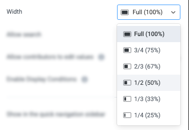
Width
Set the display width of the widget.
The width settings of neighboring widgets determine the resulting display on the interface. For example, two neighboring widgets set to 50% width display side by side. Similarly, if one widget is set to 1/3 and the following widget is set to 2/3, the widgets will display side by side.
We recommend experimenting with widget width settings and widget placement to optimize the interface display for the screen size you're designing for. That is, if you're designing an interface for a large screen (say, a request tracking interface), you can use small widget widths and include multiple widgets together. However, if designing for mobile, leaving widgets at 100% widths is generally best.
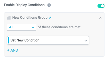
Enable Display Conditions
Select whether to dynamically display the widget based on custom conditions. When enabled, a conditions group displays; when the specified conditions are met, the widget displays.
For example, you can set a condition to display an input-type widget only if a user enters a specific value, prompting the user to provide additional information.
For more information about configuration condition groups, see Conditions.
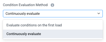
Condition Evaluation Method
Set how display conditions are evaluated:
Evaluate conditions on the first load - Evaluate conditions only when the page first loads. This option does not dynamically show or hide relevant widgets when a user makes a selection; refreshing the page is required.
Continuously evaluate (default) - Continuously evaluate conditions as the user views and interacts with the interface. Use this option to enable the interface to dynamically show or hide relevant widgets based on user input.
Show as a quick navigation tab
Select whether to display the widget as a quick navigation tab. When this option is set to Yes, this widget and all those below it will display on a single tab until the next widget that's configured to display as the quick navigation tab. Additionally, you can set the quick navigation menu label override and edit the label icon.
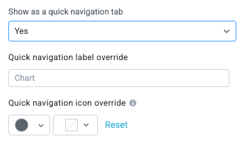
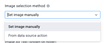
Image selection method
Select how you want to source the image. Depending on the option you select, different configuration fields display:
Set image manually - Manually upload the image and provide image details.
From data source action - Source the image from a data source action. This option is designed to allow an interface to display an image from a data source where the user viewing that image may not have access or permissions to view that image (for example, if the user doesn't have a login to the source system).
This option uses a specialized data source action, Stream Image, that's currently supported natively only for Coupa data sources.
Set Image Manually
Image Details
Set the image details and upload the image that displays in the widget by either uploading an image or providing an image URL.
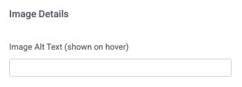
Image Alt Text
Provide the image alt text, which is shown when a user hovers over the image; alt text is also used by screen readers and when the image cannot be displayed.
Upload Image
Drag the image into the provided space or select Browse Files to select the image from your local machine.
When you upload an image, Tonkean automatically provides a URL displayed in the Image Url field.
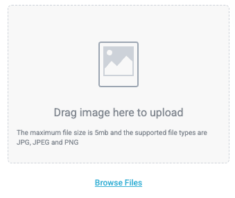
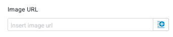
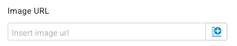
Image URL
Insert an image URL to source an image from the web. Select the insert field button,  , to use a URL from a field value.
The maximum file size is 5MB, and the supported file types are JPG, JPEG, and PNG.
Source Image From Data Source Action
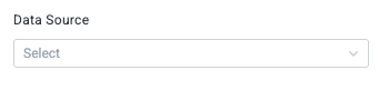
Data Source
Select the data source to retrieve the image from.
Currently, this option is configured for use with Coupa data sources. Other data sources, where they support this action, may require custom action configuration.
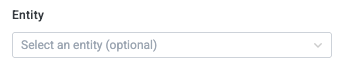
Entity
Optionally, specify the entity to source the image from. This option is designed for situations when the same stream image data source action is configured for multiple entities.
Data Source Action
Select the data source action to source the image from. The action must be of the type "stream image" and fetch based on the image URL provided.
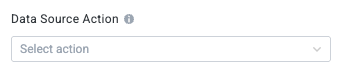
Image URL
Select the insert field button, , to use a dynamic URL field.
To stream images from a Coupa data source, follow the steps below:
Select the insert field button,
. The available fields display.Select the Original Entity Fields button. The Original Entity Fields dropdown displays.
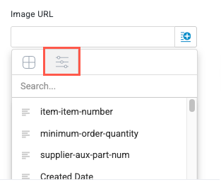
Use the provided search field or scroll down to find and select the item-image-url field. This field is automatically created when connecting a Coupa data source.
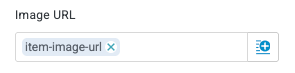
Image external ID
Optionally, include an external ID value. This value may be required for streaming images from some data sources.
This field is not required for streaming images from Coupa data sources.