Search Input Widget
Provide a search field where users can search across requests or from a connected data source. The Search widget is deeply configurable both in terms of search behavior and in display options, enabling you to optimize the experience for users.
Title
Set the title of the widget. Include a descriptive title to help users understand the specific content of the widget.
Wrap title text
Select whether to wrap title text that extends beyond the available display width. When not selected, long titles are truncated with an ellipsis.

Description
Add a description for the widget. This description displays below the widget title.
Show description as a tool tip
Select whether to display the widget description as a tool tip, hiding it by default.
When displayed as a tool tip, any rich text formatting in the description is removed.

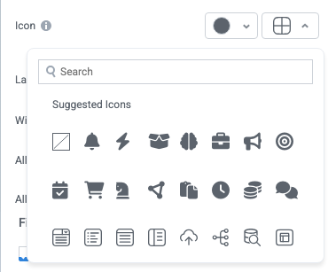
Icon
Change the widget icon and icon color—or remove the icon. Widgets always include a default icon.
Select the crossed-out icon option,  , to remove the icon.
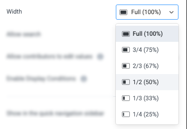
Width
Set the display width of the widget.
The width settings of neighboring widgets determine the resulting display on the interface. For example, two neighboring widgets set to 50% width display side by side. Similarly, if one widget is set to 1/3 and the following widget is set to 2/3, the widgets will display side by side.
We recommend experimenting with widget width settings and widget placement to optimize the interface display for the screen size you're designing for. That is, if you're designing an interface for a large screen (say, a request tracking interface), you can use small widget widths and include multiple widgets together. However, if designing for mobile, leaving widgets at 100% widths is generally best.
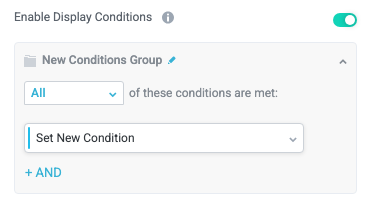
Enable Display Conditions
Select whether to dynamically display the widget based on custom conditions. When enabled, a conditions group displays; when the specified conditions are met, the widget displays.
For example, you can set a condition to display an input-type widget only if a user enters a specific value, prompting the user to provide additional information.
For more information about configuration condition groups, see Conditions.
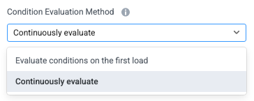
Condition Evaluation Method
Set how display conditions are evaluated:
Evaluate conditions on the first load - Evaluate conditions only when the page first loads. This option does not dynamically show or hide relevant widgets when a user makes a selection; refreshing the page is required.
Continuously evaluate (default) - Continuously evaluate conditions as the user views and interacts with the interface. Use this option to enable the interface to dynamically show or hide relevant widgets based on user input.
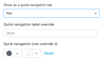
Show as a quick navigation tab
Select whether to display the widget as a quick navigation tab. When this option is set to Yes, this widget and all those below it will display on a single tab until the next widget that's configured to display as the quick navigation tab. Additionally, you can set the quick navigation menu label override and edit the label icon.
Initial search state
Set the initial state of the Search widget, including placeholder text, a default value, and more.
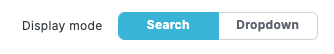
Display mode
Select whether the Search widget displays as a conventional search bar with results displayed below or as a dropdown field:
Search (default) - The Search widget displays as a conventional search field with a dedicated results area that is always displayed below. This option is better for displaying many results which the user can easily browse, and for a shopping cart type experience where an editable quantity field is needed.
Dropdown - The Search widget displays as a dropdown field, providing a more condensed view of returned results. This option is best for a dropdown which needs to look up data from a large external dataset using an API, or when results should have images and additional data that can't be shown on a regular dropdown widget. When Display mode is set to Dropdown, some irrelevant configuration sections, including Initial state illustration and Search results - editable field, are hidden.
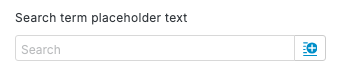
Search term placeholder text
Enter placeholder text (for example, "What do you want to search for?"). This text appears in the search field before users enter a value or select. Enter placeholder text manually or select the insert field button,  , to dynamically add a value from a field.
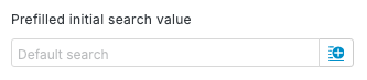
Prefilled initial search value
Enter an initial search value, enabling the widget to display by default results for that search. For example, if the Search widget appears on an interface dedicated to requesting consulting services, you may enter "consulting services" in this field.
Note that you can also select the insert field button, , to dynamically add a value from a field, such as a user-provided field on an earlier interface.
Show initial search results when search term empty
Select whether to display search results when no value is entered in the search field. This option is helpful for Search widgets with limited potential results, enabling users to see available options before entering their search terms.

Hide search input
Select whether to hide the search input, preventing users from entering search terms. This option is helpful for Search widgets with limited results, where you prefer users to select from a short list of options. For example, you can enable this option, include a Prefilled initial search value, and enable Show initial search results when search term empty to display a specific subset of results for users to select from.

Initial state illustration
Configure the display of the Search widget's initial state when the interface loads. This display appears instead of pre-filled search results.
Illustration icon
Select an icon to display in the widget's initial state. For example, for a purchase request interface search, you might select a shopping cart icon.
The icon color (if you select a solid color) is set by your configured brand color in Board Settings.
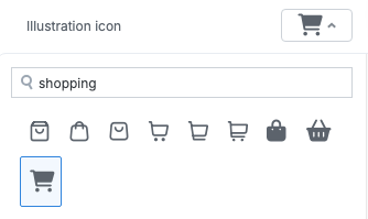
Illustration title
Enter a title that displays below the illustration icon. Use this field to provide guidance for users on how to use the widget (for example, "Search for office supplies from available catalogs"). Select the insert field button, , to enter a dynamic value from a field.
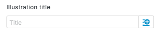
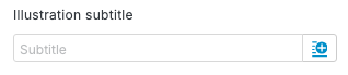
Illustration subtitle
Enter a subtitle that displays below the illustration title. Select the insert field button, , to enter a dynamic value from a field.
Search results data source
Configure the data source that search results are returned from.
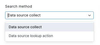
Search method
Select the method to gather results for the search:
Data source collect - Gather search results from a connected data source whose entities Tonkean regularly collects. For example, this might include connected file storage repositories like Google Drive or SharePoint, or connected product catalogs.
Data source lookup action - Gather search results by performing a live API call to a connected data source. Use this option for data sources where Tonkean is not performing a regular collect—this might include data sources with very large quantities of records that are impractical to collect on a regular interval.
Data Source Collect
Configure the search results source when gathering results from a connected data source whose entities Tonkean regularly collects.
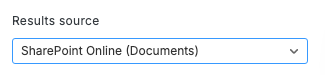
Results source
Select the data source to gather search results from.
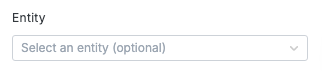
Entity
Specify the entity to search for in the data source. For example, for a SharePoint data source, this may be Folders, Files, Lists, and so on.
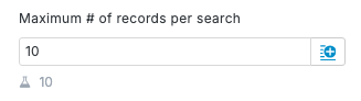
Maximum # of records per search
Limit the number of records returned in the search from the data source.
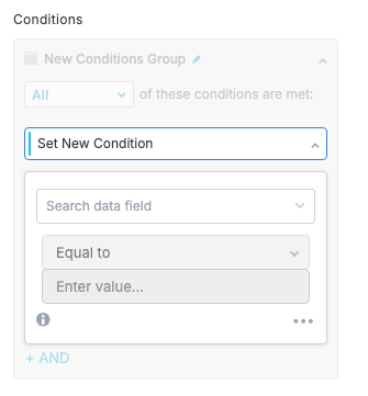
Conditions
Define one or more conditions to filter the search results.
This option only displays when you select a value for Entity. If this field is left empty, search results are ordered by the strength of the match.
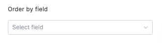
Order by field
Select the field to sort results by. Fields in this dropdown are determined by the selected Entity.
This option only displays when you select a value for Entity. If this field is left empty, search results are ordered by the strength of the match.
We strongly recommend leaving this field empty, as ordering by the strength of the match is almost always the best user experience.
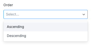
Order
Specify whether to order search results in Ascending or Descending order.
This option only displays when you select a value for Entity. If this field is left empty, search results are ordered by the strength of the match.
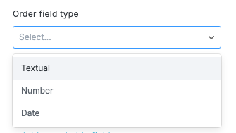
Order field type
Specify the type of field you're ordering results by. This value helps determine how to order the results:
Textual
Number
Date
This option only displays when you select a value for Entity. If this field is left empty, search results are ordered by the strength of the match.
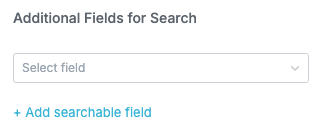
Additional Fields for Search
Select additional fields to include in the search. By default, the Search widget includes the entity name (or equivalent field). If you want the widget to search specific fields (for example, a "Description" field) in addition to the entity name/title fields, select those fields here.
To select multiple additional fields, select + Add searchable field and choose another field from the added dropdown.
This option only displays when you select a value for Entity.
Data Source Lookup Action
Configure the search results source when gathering results by performing a data source lookup.
Results source
Select the data source to perform the lookup in.
Lookup action
Select the data source lookup action for the selected data source in Results source.
Maximum # of records per search
Limit the number of records returned in the search from the data source.
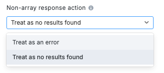
Non-array response action
Specify how to handle responses from the data source that are not formatted as an array.
For lookup actions, Tonkean expects results from the data source to be formatted as an array with the relevant value at the configured ID path. Unexpected results from the data source can return a detailed error or be treated as if no results were found, depending on your selection below:
Treat as an error - If the data source returns a non-array response, display an error message. Use this option when first configuring the widget and testing responses from the data source.
Treat as no results found - If the data source returns a non-array response, display a No search results found message in the widget. This is an appropriate user experience for data sources that return a non-array response when no results are found.
Prefetched lookup response
Provide the field that stores the results of a prefetch search performed by the Prefetch Search Widget module action; select the insert field button, , to provide this value. This action enables you to leverage information (either from integrated data sources or provided by a user) to perform a pre-search lookup, returning relevant information before the user enters search terms.
This option is useful for prepopulating the Search widget with results related to the user's need. For example, you might collect a user-provided purchase category during the intake process and use that field to pre-fetch relevant results from a purchase catalog.
The value provided in Prefetched lookup response must be the Result Field in the Prefetch Search Widget Results action.
Selecting search results
Configure options for how users select search results.
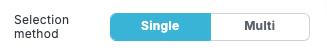
Selection method
Specify whether users can only select a Single result or have the ability to Multi-select results.
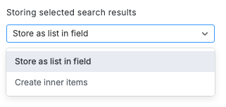
Storing selected search results
Specify how to store the selected search result or results:
Store as a list in field - Store the selected search result in a field.
Create inner items - Create an inner item for each selected search result.
Field for storing selected results (IDs)
Select the field to store the selected search results. This field is required if Storing selected search results is set to Store as list in field.
Only fields configured to store multiple values can store selected search results.
Search results - editable field
Configure options for editable fields in search results. Some common examples include fields where users can specify a quantity of an item when selecting from a catalog.
Field to edit
Select the field users can edit.
Label
Provide a display label for the editable field; this option is helpful for providing a user-friendly display name for a field that may have a more technical or potentially confusing name in the module.
Default value
Enter a default value for the editable field. For example, if configuring an editable Quantity field, you may set the Default value to "1".
Search results - image display
Configure how search results visually display in the widget, as well as how images in results display.
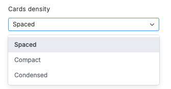
Cards density
Specify the spacing for the search result cards:
Spaced (default) - Result cards display with larger images and more space to display information (such as description fields). Use this option to display more information for each result.
Compact - Result cards display with smaller images and generally less detailed information, allowing more results to display in the same space.
Condensed - Results cards display in the smallest form factor to display the maximum number of results. This option emulates a dropdown field and removes options for adding dynamic fields.
When you set Display mode to Dropdown, Cards density defaults to Condensed.
We recommend experimenting with different densities to see what looks best for your most common search results.
Placeholder for images
Specify a placeholder for search results where no image exists:
None - No placeholder displays.
Initials - A placeholder displays with initial (provided from alt-image text).
Image - A generic placeholder image displays.
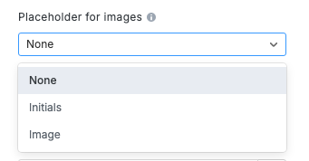
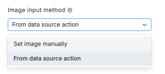
Image input method
Select how you want to source the image. Depending on the option you select, different configuration fields display:
Set image manually - Manually upload the image and provide image details.
From data source action - Source the image from a data source action. This option is designed to allow an interface to display an image from a data source where the user viewing that image may not have access or permissions to view that image (for example, if the user doesn't have a login to the source system).
This option uses a specialized data source action, Stream Image, that's currently supported natively only for Coupa data sources.
Set Image Manually
Image Details
Set the image details and upload the image that displays in the widget by either uploading an image or providing an image URL.
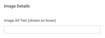
Image Alt Text
Provide the image alt text, which is shown when a user hovers over the image; alt text is also used by screen readers and when the image cannot be displayed.
Upload Image
Drag the image into the provided space or select Browse Files to select the image from your local machine.
When you upload an image, Tonkean automatically provides a URL displayed in the Image Url field.
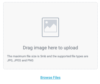
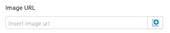
Image URL
Insert an image URL to source an image from the web. Select the insert field button, , to use a URL from a field value.
The maximum file size is 5MB, and the supported file types are JPG, JPEG, and PNG.
Source Image From Data Source Action
Data Source
Select the data source to retrieve the image from.
Currently, this option is configured for use with Coupa data sources. Other data sources, where they support this action, may require custom action configuration.
Entity
Optionally, specify the entity to source the image from. This option is designed for situations when the same stream image data source action is configured for multiple entities.
Data Source Action
Select the data source action to source the image from. The action must be of the type "stream image" and fetch based on the image URL provided.
Image URL
Select the insert field button, , to use a dynamic URL field.
To stream images from a Coupa data source, follow the steps below:
Select the insert field button,
. The available fields display.Select the Original Entity Fields button. The Original Entity Fields dropdown displays.
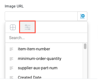
Use the provided search field or scroll down to find and select the item-image-url field. This field is automatically created when connecting a Coupa data source.
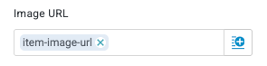
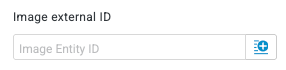
Image external ID
Optionally, include an external ID value. This value may be required for streaming images from some data sources.
This field is not required for streaming images from Coupa data sources.
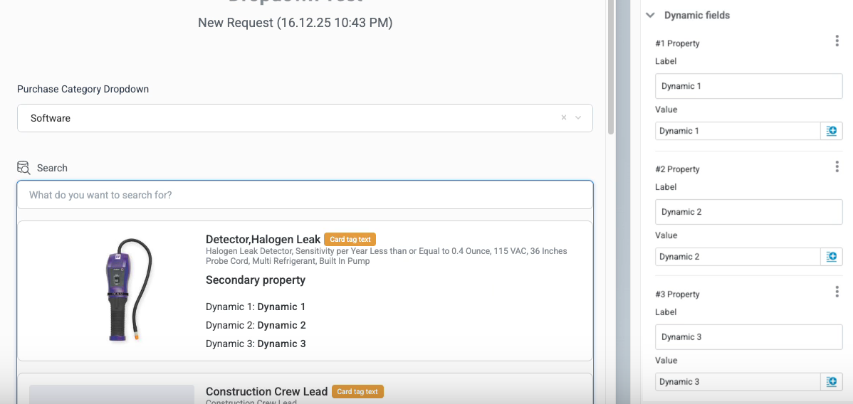
Search results - Result cards layout & fields
Configure the results card layout and field display. See below for an example of how each of these fields map to the display. We also recommend experimenting with different layouts to find the best display for your expected search results.
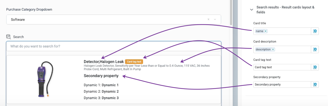
Card title
Enter a title value for the card. Select the insert field button, , to insert a field from a matched entity, like a purchase catalog.
Card description
Enter a description value for the search result. Select the insert field button, , to insert a field from a matched entity.
Card tag text
Enter result card tag text. This option is helpful for highlighting key result characteristics, like in-catalog items or those that have been previously ordered, using dynamic fields.
Secondary property
Enter a secondary property field to provide additional information about the search result.
Initial value mapping
This section enables you to define initial field values for each inner item that's created when storing search results as inner items. For each value, map an inner item manual field to a formula field that's evaluated and populated when the inner item is created.
This section only displays when, in the Selecting search results section, Storing selected search results is set to Create inner items.
Dynamic fields
Configure additional information to display on result cards.
Different Cards density values impact how dynamic fields display. Experiment with different density values to find the best layout for your expected search results.
Select + Add Property to create Label and Value fields you can provide values for. Select the insert field button, , to insert a dynamic value from a field.
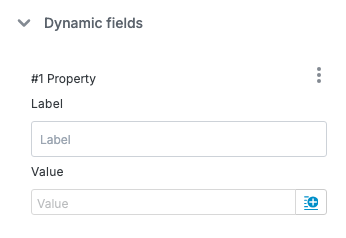
See the example below for how Label and Value fields display on a result card (with Cards density set to Spaced).